7UP debuts total brand design refresh

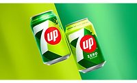
7UP, the lemon-lime flavored beverage, revealed its first total brand design refresh since 2014.
The newly designed packaging spotlights the signature elements of 7UP including bubbles, the red dot that has been a part of the logo since the 1960s and the red, white and green color pallet.
Together, these elements represent 7UP’s crisp, clean lemon-lime taste and fun personality and provide a foundational visual experience for the consumer across the brand’s portfolio, the company says.
Looking for a reprint of this article?
From high-res PDFs to custom plaques, order your copy today!


