Nesquik launches brand redesign for its powders, milks
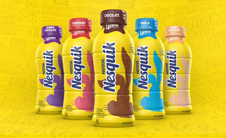
Bunny icon Quiky features new silhouetted color palate depending on product flavor

Nesquik and its chocolate powder mix has been on store shelves since 1948, and its ready-to-drink (RTD) formula debuted in 1983. Additionally, the brand’s famous bunny mascot, Quiky, debuted on TV in 1973. As the RTD category has become more competitive, the Chase Design Group, in partnership with the Nestlé Design team, sought to reimagine the brand’s youth-focused design with a refreshed brand purpose. “We were asked to modernize Nesquik in a way that captures the energy and spirit of the brand, while not feeling childish,” said Nick Leeber, associate creative director for Chase Design, is a statement. “That required communicating the evolution of the brand, its core values of positivity and optimism while also creating greater segmentation among its offerings.” The design team identified key brand assets: Quiky as the brand icon, the core yellow/blue color combination and the character of the logo. To make the brand presence more prominent, the packaging was simplified to focus on its bunny character while emphasizing a bold yellow as a beacon for the brand. Quiky was transformed into an iconic asset using a defined silhouette that still maintained the whimsical nature of the character. Clarified color coding distinguishes the five core flavored milk selections, while the three Protein Power offerings are identified with a banner across the middle of the bottle and a different communication hierarchy, the company says.
Looking for a reprint of this article?
From high-res PDFs to custom plaques, order your copy today!


