Digital playing a role in beverage package design
Social media, eCommerce important to consider in designing


Today’s consumers arguably are more engaged with a beverage’s packaging than ever before, increasingly reading ingredient lists and Nutrition Facts labels and researching products on their mobile phones before purchasing in the store, while at the same time engaging with brands on the Internet. This interaction, along with the proliferation of products on store shelves, continues to solidify the relationship between a beverage brand and its packaging.
“With the possible exception of fragrances, no other [fast-moving consumer goods] (FMCG) category is so heavily reliant upon packaging to define and reinforce the brand,” says Scott Jost, vice president of innovation and design at Chicago-based Berlin Packaging’s Studio One Eleven Division. “Since consumers don’t ‘touch’ the product, and in some cases don’t ‘see’ the product, the packaging and the product are inseparable in a way that’s fairly unique.
“As the only physical manifestation of the brand, beverage packaging does the work of encouraging trial and rebuy, so it must be visually impactful, memorable and functional,” he adds.
Digital influence
As technology becomes more engrained in everyday life, beverage packaging design has not been resistant to the changes it brings.
Pamela Long, partner and director of client services at Little Big Brands, and John Nunziato, founder and chief operating officer of the White Plains, N.Y.-based company, emphasize that beverage packaging should be designed for the digital and physical worlds, as consumers interact with products in both arenas. This includes digital interaction in-store with QR codes, shopping apps and social media.
“We’re no longer just designing for the shelf. We’re designing for the shelf and for social media,” Nunziato explains. “When we design and develop brands, we’re looking at them in all different scenarios; we’re not just looking at a print on a piece of paper and what it might look like on-shelf in a store.”
He notes that social media has opened up a new marketing access point that allows for more graphic creativity as a means to communicate with and draw in consumers to a product. However, this digital creativity also should translate to the product that consumers will see in the store, and the physical package still must convey the message that is relayed via the digital world, he says.
“I think [beverage packages are] being designed for social media, so that when you get to the store there is [a] strong enough recall that you’ll pick it up and give it a try or you’ll be able to find it quickly when you get there,” Nunziato says.
Long highlights that some beverage brands are including QR codes on their packaging in order to provide product information, coupons or other special content. She notes that as consumers become more connected, they’re also shopping with their phones, making the opportunity for digital interaction while in the store enticing and desired.
However, this isn’t the only way digital has impacted packaging design. Simon Thorneycroft, founder and chief executive officer of San Francisco-based Perspective: Branding, highlights that eCommerce is yet another digital world with a set of demands for beverage packaging.
“Packaging now has another world it needs to perform in,” he explains. “We all know how critical it is for a package to use all [of] its visual, verbal and haptics levers in the physical world, but with the increasing rise and relevance of eCommerce, packaging now needs to also perform in the digital world. And not just at the thumbnail size it will appear on an Amazon page, but when the product arrives at the consumer’s location. The ‘out-of-the-box’ experience will become increasingly more important to build brand loyalty and repeat sales for products the consumer may see for the first time online and will have to make their initial purchasing decision based on that presentation.”
Yet, the extent to which digital can become a part of a packaging could grow, Thorneycroft says. “Packaging is for brands to connect with their consumer in new and unique digital ways,” he explains. “Package structures will become smarter and more interactive with the consumer. Near-field communication (NFC) is around the corner. This allows two devices to make contact from short distances using a rapid Bluetooth or Wi-Fi connection.”
NFC has started to make an appearance in international marketplaces, but has yet to proliferate in the United States, although Thorneycroft expects it to soon. When it comes to incorporating the technology, he notes that considerations should be made.
“The key thing to remember about any integration of new digital technology with a package is that apart from the novelty factor, which can provide some PR value and initial purchase based on consumers’ curiosity, for the solution to have any longevity, it will have to provide real value to the consumer,” Thorneycroft explains. “Whether that be a piece of information that’s going to reinforce their purchasing decision or cause them to overcome any resistance. This can be confirmation that the product is fresh, recipes, maybe a video about product benefits, more background on product attributes, etc.”
Creating a presence
Although the digital world is playing a role in packaging design, creating a stand-out presence on-shelf still is important in order to make it into the shopping cart, experts say.
“Packaging needs to leverage haptics as much as possible,” Thorneycroft says. “Research shows that 70 percent of purchase decisions are made at the shelf and the rest can be influenced at shelf. So, making the strongest first impression still counts. The packaging shape, material, printing and finishing techniques are not just key in making a great first visual impression, but when the consumer picks up that package, the ‘feel’ or haptics of it then come into play.”
He notes Los Angeles-based Califia Farms LLC as an example of a brand that has created a unique visual appeal, which stands out from the other packages that surround it on the shelf. “While everyone else is using the pretty much standard milk square plastic or paperboard containers, this brand chose to use a non-traditional shape that adds to its shelf impact and distinctiveness in the plant-based milk category,” Thorneycroft says.
Little Big Brands’ Nunziato also notes that structure is a way to set a product apart from others. However, the costs of customized packaging are important to consider and might not be reasonable for some manufacturers. Yet, there still is opportunity to create a stand-out package, he says.
“We get that custom structure is expensive, and stock structure is done and you can license it,” he explains. “… There’s also the opportunity to modify or slightly customize a stock structure.”
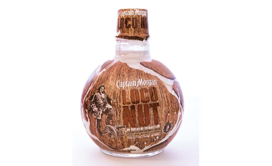
Whitney Repp, vice president of client management at BevBiz Marketing LLC, Avon, Conn., notes that a unique package can be created via a variety of elements. “All the elements of beverage package design can be manipulated to deliver on the brief, combining at various levels to create something integrated, compelling and aesthetically pleasing,” she says. “These elements include bottle shape, closure, front and back labels, shoulder labels or imprints, seals, neckers that tell a story, or a stylized gift carton. Brand owners can pull all these levers to create something truly unique or, all too often, derivative.”
Along with the shape of the structure, transparency — physically and figuratively — also is a growing trend in packaging design as manufacturers now are interested in highlighting the product within the package, Little Big Brands’ Long adds.
“I think that brands are getting a lot more transparent about what’s in the bottle, and that definitely is branching over into the design itself,” she says.
Pete Hayes, director at PB Creative Ltd., London, notes that 3-D design also can offer an uncommon graphic appeal. “Leveraging 3-D design provides further opportunity to stand out above competitors,” he says. “… A bespoke 3-D design can deliver a more potent projection of the brand personality, especially when teamed holistically with a striking 2-D design. Ultimately, ensuring that every element of the packaging, from the shape of the bottle to the design on the label, truly reflects the way you want the brand to be perceived is key to its differentiation and success.”
Delivering a message
Although creating an aesthetically pleasing and unique package is important, having a message and identifiable brand concept or identity also is essential, experts say.
Perspective: Branding’s Thorneycroft notes that branding is important to encourage interaction, communication and relationships with consumers.
“Because consumers want brands they can have a relationship with, believe in and hold a conversation with, they want to know what the brand stands for and will hold it accountable for promises it makes,” he says.
A package needs to have several key components in order to be successful in this aspect of its design, according to Thorneycroft. “First, the brand needs an identity that stands for something. I don’t necessarily mean a ‘logo’ but an identity — a visual representation of the brand story that will ultimately connect with the consumers’ belief system. This must be easily understood and memorable,” he explains. “Next, a definition of the brand experience — likely a combination of both imagery and language. What will the product do for me; what will I experience if I consume it?”
PB Creative’s Hayes notes that a solid brand identity and message are essential for creating long-term success. “These are the foundations for any great design,” he says. “You are designing purely for the brand, which encompasses who the consumer is, the brand proposition, personality and strategy. Without that, you’re just designing for aesthetics sake and there’s no longer-term future in that.”
Bringing together all of these components in the right ways can create a unique package to drive the product within, BevBiz Marketing’s Repp says. “Whether economy, premium or ultra-premium — any price segment — a good package will stand out on the shelf for impact, reinforce brand position for equity, connect with a specific targeted demographic for relevance, and differentiate itself from the competitive set,” she says.
Perspective: Branding’s Thorneycroft adds: “For an existing customer, [successful packaging] should remind them why they already buy and love the brand/product. It should reinforce the ideas they believe to be true and make them feel smart about the choice to continue to buy it or pay more for it. For a lapsed or non-user, it needs to provide them with a reason to switch. It must stand out from the competition and communicate values/beliefs that connect to that consumer, and more so than their current choice.” BI
Looking for a reprint of this article?
From high-res PDFs to custom plaques, order your copy today!


