Jim Beam announces first-ever global packaging redesign
Packaging redesign part of Make History marketing campaign
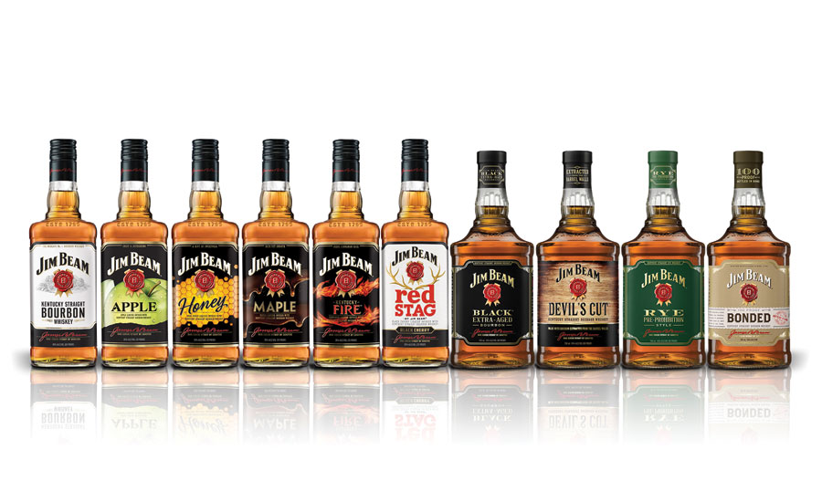
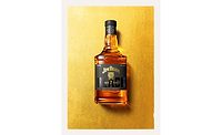
Jim Beam announced that its complete lineup of bourbons was transformed with all-new packaging. The new packaging rolled out this month in London and other parts of Europe and will hit U.S. markets this summer. This marks the first time significant changes have been made to the brand in decades, the company says. The new Jim Beam bottles have a bolder structure with a clean label design featuring premium finishes, refreshed distiller portraits and a refined “rosette” logo, harmonizing the flavored product range. Jim Beam Devil’s Cut and Jim Beam Rye feature a bolder, more rectangular bottle structure with premium label enhancements, including extra-fine detailing, crafted borders, gold foil finishes, refined embossing and matte paper stock, the company says. It also includes a matte finished shrink sleeve along the closure. The global packaging upgrade comes two years after the launch of Make History, the first global marketing campaign for the iconic American brand, which traces its history to 1795. The updated bottle and exterior styling better represents the premium bourbon inside, the company adds. The redesign will contemporize the Jim Beam brand while celebrating its rich heritage, it adds. As an ongoing evolution of Jim Beam’s Make History campaign, the premium packaging launch is being supported with in-store point of sale (POS) showcasing the upgraded bottles and advertising featuring global brand partner and actress Mila Kunis.
Looking for a reprint of this article?
From high-res PDFs to custom plaques, order your copy today!
