The Best Packages of 2013
Top packages showcase functionality, shelf appeal


What does it take to make a great package? According to Beverage Industry’s Best Packages of 2013 survey, emotional appeal, form and function, and a custom shape can give brands a leg up in the competitive beverage marketplace.
The Beverage Industry editors examined the plethora of new products and package redesigns that were released in 2013 and whittled down the list to our Top 10. These packages were then put to a reader vote on bevindustry.com. After a record-breaking 1,489 votes, you, the readers, selected the following Top 5 packages to win the title of the Best Packages of 2013.
Kool-Aid Liquid
Northfield, Ill.-based Kraft Foods Group Inc.’s Kool-Aid Liquid bottle garnered 40 percent of the votes, making it the No. 1 Best Package of 2013.
Kool-Aid Liquid bottles were designed as part of the brand’s campaign, “Smile. It’s Kool-Aid.” The campaign introduced a new look and feel to the brand as well as a makeover of its mascot, Kool-Aid Man. His new image includes an updated look, with emphasis on his original pitcher-focused personification, the company says. To physically showcase these changes, the structure and labels of the Kool-Aid Liquid bottles resemble the shape of the Kool-Aid Man. As a result, the 1.62-ounce liquid concentrate bottles were designed to emotionally connect with consumers.
“Kool-Aid Man brings a smile to your face and fun to any occasion,” says Russ Dyer, director of corporate affairs for Kraft. “The goal of this design was to elevate his presence and bring him to life as a package, creating the ability to interact with the consumer.”
The differentiated bottle shape and color-coded design by flavor also helps the liquid concentrate to stand out on the shelf and reinforces the brand’s recognizable equity — the Kool-Aid pitcher and smile, Dyer adds.
From a functional standpoint, the curved bottle shape promotes ease of use with one hand, and the small size allows it to easily fit in the consumer’s hand, Dyer says. Plus, its size makes it convenient and portable, he adds. One bottle contains enough liquid concentrate to make 24 8-ounce drinks and is small enough to fit in consumers’ purses or pockets for use at any moment. “The Kool-Aid Liquid bottle embodies the spirit of the brand — enabling moments of unexpected fun,” he adds. “It simply makes you smile.”
Kool-Aid Liquid is available in Tropical Punch, Cherry, Grape and Orange varieties in mass market and grocery retailers nationwide.
Stout 21
Stout 21 aluminum shooter tubes by Stout Brewing Co., Kings Mountain, N.C., ranked second among the Best Packages of 2013 with 17 percent of the vote.
This package’s design was all about shelf differentiation, says Stout Brewing Co. Founder and Chief Executive Officer Cody Sommer. “Our philosophy as a business is to be unique, innovative and incremental in all aspects of our business,” he says. “Stout 21 is positioned as an alcohol shot, and it was very important to the company from the beginning to ensure that consumers would find our products to look very unique.” This differentiation helps prevent confusion with energy shots and other beverages in small containers, he says.
When designing the 3-ounce, vial-style tube, the brand also wanted a package that showcased its premium-quality attributes, Sommer says. Therefore, Stout Brewing partnered with an aluminum beverage container manufacturer to create its now patented design.
Stout 21’s packaging expresses the idea of a shot or shooter, Sommer says. The round bottom of the bottle helps the liquid roll out of the container, and the diameter and neck of the tube are very close in size to allow for a smooth pour, he says. Plus, the aluminum material allows the product to be chilled in a few minutes to ensure optimal temperature for enjoyment, he adds.
The size of the package also helps meet the needs of different consumers. It is small enough to be easy to hold, and it contains a suitable amount of liquid for consuming Stout 21 as a shot, Sommer says. However, 3 ounces also is enough liquid to enable the drink to be sipped as a cocktail, he adds.
Stout 21 currently is available in Florida, Georgia and Louisiana. The company also has plans to release the product in Texas in January, followed by launches in other states throughout 2014. The alcohol tubes retail for approximately $1.99 each.
Space Saver juices, lemonades and teas
Trailing Stout 21 by 10 votes was Space Saver juices, lemonades and teas by Leahy-IFP, Glenview, Ill. When creating this package, the company melded the requests of consumers and foodservice customers to create a package that focuses on form and function, says Joe Arends, marketing manager for Leahy-IFP.
“Based on increased consumer acceptance of the bag-in-box format and the increased demand for non-carbonated beverages to fit into tighter shelf spaces, we set out to design a large-volume package that was similar to the already popular ‘fridge pack’ for canned soda and beer,” Arends explains.
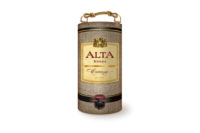
The 5-liter, aseptic bag-in-box package easily fits into most refrigerators while taking up minimal space, even though the aseptic juices do not require refrigeration, Arends says. The box also features a no-drip spout, similar to that of boxed wines, with easy-to-understand operating instructions on the box, he says. Additionally, it features a carrying handle for convenient transportation, he says. Altogether, this design makes it easy to serve premium, ready-to-drink juices, lemonades and teas at home or on-premise, he adds.
As an environmentally responsible package, the Space Saver box is constructed with Sustainable Forestry Initiative certified recyclable corrugate, Arends says. In addition, the energy used in production is reduced 50 percent, post-consumer solid waste is reduced 22 percent, and greenhouse gas is reduced 7 percent compared with a 64-ounce PET bottle, he adds.
Space Saver juices, lemonades and teas are available through foodservice distributors and online at spacesaverbeverages.com. The company also is in the process of broadening its consumer presence through planned distribution in retail and club store outlets in 2014.
The Sam Can
Coming in fourth place is Boston-based The Boston Beer Co.’s The Sam Can, which received 15 percent of the vote.
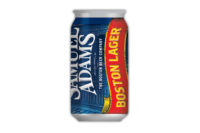
The Sam Can marks the craft beer brand’s first move away from aluminum bottles in consumer packaging. “The bottle vs. can debate has been ongoing for years among those in the craft brewing community,” says Jim Koch, founder and chairman of The Boston Beer Co. “Even as craft beer in cans was starting to become more common, we had our doubts about the can’s impact on flavor. But cans have changed, and we spent over two years — and $1 million — ensuring that our beers would taste just as flavorful in cans as they do in bottles.”
To create the 12-ounce Sam Can, The Boston Beer Co. partnered with can manufacturer Ball Corp., global design firm Ideo, and a sensory expert to understand can design and technology and create a can that enhances the consumer’s sensory experience, Koch says.
“The difference between The Sam Can and a standard beer can is subtle, but The Sam Can delivers an enhanced drinking experience,” Koch says. “The flared, curved lip works to deliver beer to the front of the palate to maximize the early enjoyment of the malt sweetness while also creating a smoother, more comfortable overall drinking experience. The wider lid of The Sam Can naturally opens up the mouth, allowing for more air flow, and positions the drinker’s nose closer to the aromas of the beer.”
The beer’s availability in cans also enables consumers to enjoy Samuel Adams beer in places where glass bottles are not allowed, such as beaches, parks, pools, sporting events, boats and airplanes, Koch says.
Pepsi’s swirled bottle
Rounding out the Top 5 is Purchase, N.Y.-based PepsiCo’s Pepsi bottle redesign with 5 percent of reader votes. As the brand’s first redesign in 16 years, the new Pepsi swirled bottle extends beyond Pepsi to the Diet Pepsi, Pepsi Max and Pepsi Next brands and connects with the brand family’s “Live for Now” positioning.
“When we were looking at updating the former bottle, we wanted to create a bold design that not only stands out at retail but also evokes the swirl design that has been associated with Pepsi for decades,” says a Pepsi spokesperson. “Our ‘Live for Now’ positioning played a key role in influencing the design. We wanted our packaging to become a tangible way to convey ‘the excitement of now,’ and the new look accomplishes that — it is a modern take on a classic look.”
The new bottle features a swirled bottom as a design aesthetic and functional element, the spokesperson says. “The swirl provides a tactile, functional benefit that makes the bottle more ‘grippable’ and comfortable in the consumer’s hand,” she says. “It’s not only easier to notice it in stores but easier for our consumers to enjoy as well.”
But the swirl element is not new to the Pepsi packaging, the spokesperson notes. In fact, Pepsi’s early glass bottles featured a proprietary swirl shape, she explains. This newer packaging is a modern, energetic twist on the classic design that still retains the character of the Pepsi brand, she says.
“The design is distinctly Pepsi — we think even without the Pepsi label [consumers] would know that this is a Pepsi package,” the spokesperson says. “It’s a striking new look on-shelf compared to everything else that is out there. Just like ‘Live for Now,’ the new design conveys a youthful, bold and energetic spirit that embraces innovation in everything we do.”
Pepsi’s swirled bottle is available in 16- and 20-ounce PET bottles as well as 12-ounce glass bottles as a premium package in select markets. The company plans to release the bottle nationwide in 2014 as it converts its packaging lines.
Honorable mentions
Ranking sixth in the Best Packages of 2013 voting is Budweiser’s bowtie-shaped can. St. Louis-based Anheuser-Busch introduced the new can, which mirrors the brand’s bowtie logo, in eight-packs in May. Manufacturing the specially shaped can requires a 16-step process, including 10 steps to form the bottom half of the can and an additional six steps to form the top portion, the company says. The result is an 11.3-ounce can with a slimmer middle and sleek design, it says.
Trailing by just eight votes, San Francisco-based Crystal Geyser Water Co.’s Tejava bottle came in seventh place. The proprietary 18-ounce PET bottle features a 3-D, hand-sculpted tea leaf motif that gives the impression that the bottle is wrapped in tea leaves, the company says. “Iced tea is an iconic American tradition, and Tejava’s new proprietary PET bottle will set a new packaging standard in the ready-to-drink tea category,” said Doug MacLean, chief executive officer of Crystal Geyser Water Co., in a statement. “The lifelike tea leaf design allows people to feel the tea leaves on the outside of the bottle, which echo the origins of our pure black tea.”
Close behind the Tejava bottle is a two-way tie for eighth place between Chicago-based MillerCoors’ Miller Lite on-premise bottle and Orlando, Fla.-based Barnie’s Coffee Kitchen’s Pronto! liquid coffee concentrates. The Miller Lite on-premise bottle is a modern twist on the brand’s signature long-neck bottle and features broad shoulders and a contoured grip for easy handling, the company says. The package was available exclusively in restaurants and bars during summer 2013. Barnie’s Coffee Kitchen’s Pronto! offers single-serve packets of cold-brewed liquid coffee concentrates. These packets are designed for mixing with 10 ounces of hot or cold water to create an instant coffee beverage. The Pronto! packets are sold in boxes of six with a suggested retail price between $5.98 and $6.98.
Closing out the Top 10 is the Star Bottle by Heineken USA, White Plains, N.Y. This redesign of Heineken’s signature green glass bottle made its national debut in March in 12-ounce and 22-ounce sizes. The Star Bottle features a taller, thinner shape for a more modern and premium look as well as an embossed thumb groove that improves grip and encourages consumers to hold the bottle at a lower point, keeping the beer colder for longer, the company says.
Looking for a reprint of this article?
From high-res PDFs to custom plaques, order your copy today!

