Beverage Industry unveils Best Fleet Graphics winners
Distributors use graphics to support marketing messages


As the product mix handled by most distributors continues to grow, so, too, have the market niches for which a distributor needs to create a diverse range of marketing messages and effective methods to deliver those messages. Vehicle graphics continue to deliver locally targeted messages to a large and diverse audience.
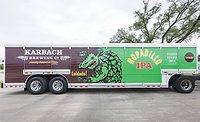
Now in its fourth year, Beverage Industry’s Best Fleet Graphics competition was created to recognize distributors that have taken advantage of modern graphics technology to deliver unique marketing messages on their trucks, and hopefully, to inspire others to follow suit.
Each year, many of the competition entries tend to fall into a few major themes, and 2016 was no exception. Two of the most prevalent themes were promoting the eco-friendly alternative fuels, and bottlers/distributors borrowing a page from the increasingly popular world of food trucks.
The 2016 awards for Best Fleet Graphics and also for Best Eco Promotion go to Try It Distributing, Lancaster, N.Y., for its creative use of a green hot-rod style flame design to identify its 43 new compressed natural gas (CNG)-powered Kenworth tractors.
Earning a runner-up position for Eco Promotion was Nestlé Waters North America (NWNA) for including a subtle, but still significant graphic element identifying the trucks in its newly deployed fleet of more than 150 Roush CleanTech propane-powered Ford F-650 side-load trucks.
Whether the “green” messaging about eco-friendly trucks is subtle, like the NWNA trucks; wall-to-wall, like some of our previous winners; or hitting the “Goldilocks just right” spot, like the Try It trucks, it’s definitely important to get that message in front of eco-conscious consumers.
Printed Pixel, an advertising graphics firm based in South Amboy, N.J., worked with Avery Dennison to create full-body wraps for a series of step vans styled like food trucks. The trucks were designed for “experiential marketing” of a wide range of beverages, including iced coffee, ready-to-drink tea, juice and wine.
The “drink trucks” expand the capabilities of distributor/bottler street teams that appear at public sampling events.
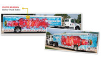
Out of the Top 4 submitted by Printed Pixel, the favorite, taking the award for Best Drink Truck, was the Casella Wines’ Yellow Tail Moscato Taste Challenge design for its bold use of color and texture. Taking the runner-up spot for Drink Trucks was the Cumberland Farms Iced Coffee design for its combination of photo-realism and high-contrast color.
Finally, I’d be remiss if I didn’t recognize the newest version of the design that helped inspire the original idea behind Beverage Industry’s Fleet Graphics Competition. On a visit to Powers Distributing in Orion, Mich., I noticed that Chief Operating Officer Gary Thompson had a scale-model mock-up of the original Miller Lite “Hanging Lites” trailer wrap design in his office. Seeing that design for the first time fueled efforts to create a recognition program for innovative fleet graphics.
Taking the award for Best Sequel is the Miller Lite “Hanging Lites II” design, which was updated to include the latest package branding on cases of beer that are so “Lite” they float to the trailer’s ceiling. BI
Looking for a reprint of this article?
From high-res PDFs to custom plaques, order your copy today!
