Using body language, people can express themselves in a variety of ways without saying a word. Likewise, packaging offers its own form of “body language” to attract shoppers upon first glance. New York-based 4sight Inc. refers to this as “form language.”
“With a proliferation of new brands and products, the beverage category has become even more competitive,” says Stuart Leslie, president of 4sight Inc., New York. “Information overload in the retail environment (in the aisle or behind the cooler door) makes it even harder for consumers to really read or understand text or graphic promises. Therefore, the design of the packaging structure becomes the first line of communication. It speaks to the consumer in a language that is intuitively and emotionally understood.”
Structure, color and finishes all can help a package “speak” to shoppers and distinguish itself on the shelf, according to experts. However, how to successfully execute a design varies by brand and category. And in the beverage industry, where shelf space is increasingly limited and brands are starving for attention, it can be even more challenging.
Pamela Long, partner and director of client services for Little Big Brands, White Plains, N.Y., notes that the beverage industry boasts some of the most crowded aisles in which the firm works.
John Nunziato, founder and creative director of Little Big Brands, affirms this point, adding, “You can walk into a cooler aisle and have a good 40 different brands in there in different substrates and print processes and [at] different eye levels, and everyone’s screaming for attention in that aisle.”
The right way to stand out
The first step in gaining attention is using contrast to get a product noticed on the shelf, says Jonathan Asher, executive vice president of Perception Research Services Inc. (PRS), Teaneck, N.J. “It’s about standing out and being distinctive from what’s around you,” he says.
However, the packaging also should engage shoppers and get them interested in the product, Asher adds. “If you’re driving down the highway and there’s a car accident on the side of the road, that’ll get your attention, but it’s not a good thing,” he explains. “You’ve got to make sure you’re also creating appeal.”
Additionally, if a shopper is looking for something specific, category cues become more important, Asher notes. For instance, the color green is a category cue for ginger ales, and if a brand owner released a ginger ale in blue packaging, the product would stand out from the rest of the category, but shoppers likely would not realize that it is ginger ale, he explains. “That’s where it comes back to balancing appropriateness with visibility,” he adds.
Structured for visibility
Nevertheless, visibility is necessary in all shopping instances to result in a purchase. “If [shoppers] don’t see it, then there’s no opportunity to attract somebody and get them interested,” Asher says.
Structure is one of the best ways to maximize visibility, he says. Atlanta-based The Coca-Cola Co.’s flagship Coca-Cola bottle is a prime example of a specific packaging shape that connotes the brand, he notes. However, brand owners do not use unique structures as often as they should,
he says.
Little Big Brands’ Nunziato echoes this point, adding that adapting a custom bottle shape to the production line and keeping it within budget can be difficult, but it helps to support the benefit of a product as well as its personality. For instance, some beer brands have shifted from aluminum cans to aluminum bottles, which maintains the functionality of the packaging but enables more freedom in design, he says.
Another successful example comes from Los Angeles-based Roll Global LLC. Its Pom Wonderful brand uses a custom structure to help it stand out and get an edge on the competition, says Simon Pendry, creative director for Bluemarlin, Brooklyn, N.Y.
“The unique double-bulb structure boldly and beautifully reinforces the brand’s positive personality and drives differentiation from the competition,” he says. “Not only does the structure help to make the brand pop at shelf, but it is reminiscent of pomegranates, communicating the brand’s close-to-the-source claim.”
Another example comes from Purchase, N.Y.-based PepsiCo Inc. Its 20-ounce Mountain Dew bottle features a grip area as well as visual and tactile elements that are molded into the bottle, 4sight’s Leslie says. This helps the brand to communicate an “exciting, active, energy-fueled drinking experience,” he says.
Colorful variations
If a brand isn’t able to differentiate itself through structure, many other options exist to aid in brand differentiation. One such option is color.
“The quickest way to differentiate from the competition is with the use of color,” says Lyle Zimmerman, president of Chicago-based Alchemy Ltd. “If you have the ability to incorporate color that is unique to your category, then your brand will immediately stand out.”
For instance, Ft. Lauderdale, Fla.-based National Beverage Corp.’s LaCroix sparkling water brand incorporates bright, bold colors for its 12-packs that stand out in a category that previously featured dark or muted colors, he says.
New York-based Pernod Ricard USA’s Malibu Rum brand differentiates itself from the rest of the segment by covering its standard bottle in white shrink-wrap, which is uncommon in the spirits category, PRS’ Asher notes.
Brands also can use color across multiple SKUs to create a billboard effect on the shelf, notes Don Childs, senior vice president and executive creative director of Northbrook, Ill.-based Brandimage, a part of Schawk Inc. Dr Pepper Snapple Group’s Sunkist brand and Kellogg Co.’s Kellogg’s To Go brand are good examples of this strategy, he says.
Shelf strategies
Limited-edition packaging also can help to create a shelf block for a brand, Bluemarlin’s Pendry says. “[Limited editions] create new news for a brand to keep consumers interested while also providing a chance to defend shelf space within the multiples,” he says.
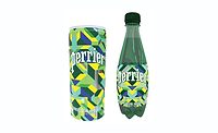
Last summer, Stamford, Conn.-based Nestlé Waters North America released a limited-edition Andy Warhol-inspired Perrier bottle collection to celebrate the pop artist’s 85th birthday. This gave the brand something new to offer at the shelf and also leveraged an aspect of the brand’s history in which Warhol featured the bottles in a series of his work, Pendry explains.
However, obtaining multiple facings on a shelf or an ideal shelf position often is a challenge for smaller brands, PRS’ Asher notes.
“Bigger brands tend to get more facings; if you get more facings, you have more visibility, and that tends to lead to more sales, so it perpetuates: The bigger brands continue to be bigger brands,” he says. “But there are things you can do to overcome that if you’re a small brand with fewer facings or if you get less-than-ideal shelf positions.”
In addition to custom structures and colors, Asher notes that packaging materials, finishes, foils, closures and embossing can help a brand get attention on the shelf. In terms of varnishes and finishes, Little Big Brands’ Nunziato notes that the design firm developed a silver logo with a vignette over it for Walnut Creek, Calif.-based Fix Brands Inc.’s anti-aging beverages.
“The logo itself is knocking out to a giant silver logo that’s actually vignetted, so it gives it a shadowing effect,” he explains.
Furthermore, beverage-makers can consider the effect that LED lighting in coolers could have on a brand, he adds.
“In a lot of the coolers, the lighting’s gone to LED lighting, so you’re actually getting a cast of a blue tone from LED lighting and, really, designers need to be aware of that, because you can actually design things to work with the type of lighting that the beverage might be in.”
Design by demographic
When it comes to designing packaging according to gender, ethnicity or age, designers also should be aware of changing interests, according to design firms.
“As gender stereotypes evolve, designers need to understand what appeals to males and females beyond the obvious,” Bluemarlin’s Pendry says. “Black for men and pink for women isn’t enough anymore. Areas such as material, typography and humor should be explored as alternatives.”
In particular, 4sight took Chicago-based MillerCoors’ new Miller Lite glass bottle to the next level when it discovered an important need among male consumers during consumer co-creation sessions. The firm discovered that “masculine” was an important cue to men, but they also wanted the bottle to promise “charisma” to help them stand out from other men on-premise and appeal to women, Leslie says. As a result, the Miller Lite glass bottle features a tactile area within the glass with a subtle sparkle, he says.
Additionally, Little Big Brands worked with Boston-based Something Natural LLC to redesign its sparkling waters to be more female-friendly. In doing so, designers brought a more “fashionable” aspect to the design that makes the beverage a trendy accessory, not just a drink, Long says.
Affirming this significance, Brandimage’s Childs notes that a package’s “status symbol” is one of its most important assets.
In terms of designing packaging for ethnic groups, such as Hispanic and Asian consumers, Alchemy’s Zimmerman points out a design strategy that might not be obvious to many designers. For these groups, visuals are desired more than bilingual labeling, he notes.
“I’ve consistently heard from consumer research that these buyers want very much to feel that they are acclimating to our culture, and they do not want to be catered to with bilingual labeling,” he says. “At the same time, they’re much more likely to purchase products they can identify based on strong visual imagery.” Therefore, visuals such as illustration, graphics or photography are extremely helpful, he adds.
On the other hand, retro packaging is a more obvious design strategy that is consistently successful at targeting senior consumers who connect nostalgically with the brand, Zimmerman notes. However, this packaging style also appeals to younger consumers, because they often are fascinated by the novelty of the brand and the “time capsule experience,” he says. Unlike other packaging strategies, this one typically works regardless of what the original packaging looked like, he notes.
Related: The challenges of PET packaging design in the beverage industry


