Best Fleet Graphics of 2013
Leading fleets use innovative graphics to stand out
Apart from buying a pricey ad during the Super Bowl that would be seen by a few million viewers once each year, one of the next best methods of beverage marketing is in the form of delivery truck graphics, which can be seen by millions every day. Vehicle graphics can deliver a locally targeted message to a larger and more diverse audience than even the largest of TV events.
In an earlier time when most distributors offered products from just one or a few bottlers, selecting the graphics for a truck was a simple matter of choosing the proper size of a bottler’s current design. But as distributors’ product mixes have grown exponentially, it has become necessary for a fleet’s graphics to include multiple bottlers and brands and to deliver a message more tightly focused on the local audience.
Given today’s need for a more diverse range of vehicle graphics, far too many trucks still carry the relatively generic packages offered by the national and global bottlers. Even if the goal is to promote a national or global brand, there are plenty of ways to localize the advertising message of a mega brand.
To recognize distributors who have taken advantage of modern graphics technology to deliver a unique message on the trucks that deliver their products, Beverage Industry launched its inaugural Best Fleet Graphics competition. In this first year of the competition, entries were limited to beer distributors, but plans call for opening the competition to all beverage segments in 2014.
The 2013 award for Best Fleet Graphics was tied between Crescent Crown Distributing’s SanTan Brewing trailer and Powers Distributing’s Miller Lite trailer. The SanTan trailer’s bold graphics not only promote a variety of individual brands but also make the local connection. On the other hand, the Miller Lite trailer uses photo-realistic imaging to humorously communicate the “light” message while at the same time including members of the distributor’s founding family for a personal touch. BI
Additional winners are...
Best Craft Beer Graphics
Crescent Crown Distributing Arizona — SanTan Brewing Trailer
Although its background color might present some temperature challenges in a market like Phoenix, using black as the starting point on Crescent Crown’s SanTan Brewing trailer provides the ultimate in contrast to help the marketing message punch through. Huge lettering leaves no doubt that SanTan is a local craft brewer offering multiple brands, each represented with a full-color logo. (Also tied for Best Fleet Graphics)
Craft Beer Graphics Runner-Up — Tie
All Star Distributing —
Craft Beer Brands Trailer
A MillerCoors distributor based in Reading, Pa., All Star Distributing also carries a selection of craft beers from multiple bottlers. All Star was uniquely able to bring competitive craft brewers together to co-market their brands on a trailer primarily used for on-premise accounts. A clean, white background worked well with a wide variety of bottler logos.
Craft Beer Graphics Runner-Up — Tie
JJ Taylor Distributing Minnesota —
Summit Brewing Trailer
“Proudly Brewed in St. Paul, Minnesota” says the elegant design just below Summit Brewing’s company crest. The simple, direct message is augmented with a shadowed background that includes elements from both the brewery and the city skyline.
Best Photo-Realistic Wrap
Powers Distributing — Miller Lite Trailer
Powers’ “Light-Lite” trailer offers an example of using unique graphics to promote a major brand. By using computer-generated, photo-realistic images, the design offers a tongue-in-cheek message that Miller Lite is so “light” that they stack the cases from the ceiling down instead of from the floor up. To add a personal touch, the photos of company presidents Gerald and Robert Powers are superimposed on the image of the floating cases. (Also tied for Best Fleet Graphics)
Photo-Realistic Wrap Runner-Up
Crescent Crown Distributing Arizona — Air Force Salute Trailer
Located just north of Luke Air Force Base in suburban Phoenix, Crescent Crown employed a photo-realistic full-trailer wrap in its salute to the local airmen. The image of an F-16 Fighting Falcon in flight serves as a background for the text, the Air Force and 56th Fighter Wing insignia, and a small Crescent Crown logo.
Best Environmental Graphics
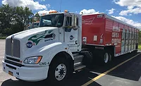
Powers Distributing — Clean Air Trailer
As one of the industry’s leading “green” fleets, Powers Distributing had already been running on biodiesel fleet-wide. When they deployed their first hybrid tractor, Powers used a specially decorated “Clean Air Vehicle” trailer to communicate an environmentally friendly message to the local community.
Looking for a reprint of this article?
From high-res PDFs to custom plaques, order your copy today!


