Beverage brands launch first-ever package redesigns
Shock Top, Wicked Joe Organic Coffees announce new packaging


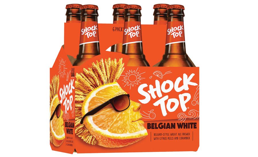


Shocking
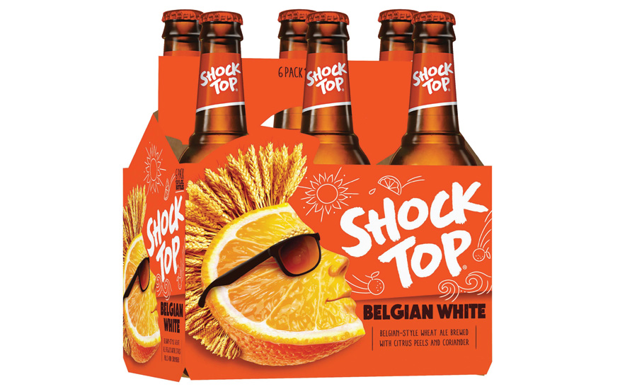
Shock Top rolled out its first major brand refresh. The new look and feel still embodies the carefree spirit of the brand, but with a fresh, youthful optimism, the company says. The new look will be reflected across all brand assets and activations, the company says. The new packaging will feature a dynamic look with a new logo, hand-drawn graphics and a reinvigorated Wedgehead, it adds. “Shock Top is known for its laid-back, carefree vibe, but this year, we’re growing up without letting go of being young. We’re turning up the volume with a vibrant, new energy and look that’s ready to shake things up,” said Jake Kirsch, vice president of Shock Top, in a statement.
A reflection of progress
Wicked Joe Organic Coffees rolled out new packaging after more than 12 years in business. The product line now sports a cleaner, more modern look, including black and chrome brand elements and an array of accent colors indicating the individual blend, flavor or bean’s origin, the company says. The company has grown and refined operations in the past decade, and owners, Bob and Carmen Garver, wanted a package design that would more accurately reflect the roaster’s progress and focus on quality and professionalism, it says. “We are very excited about where we are with the business right now, and we think a fresh new look captures that feeling,” Carmen Garver said in a statement. “We worked collaboratively with our staff and explored many possibilities, and, ultimately, we wanted to communicate a vintage feel that could translate in today’s market.” The colorful, lively nature of the new bags aims to stand out on retail shelves, it adds.
Clear communication
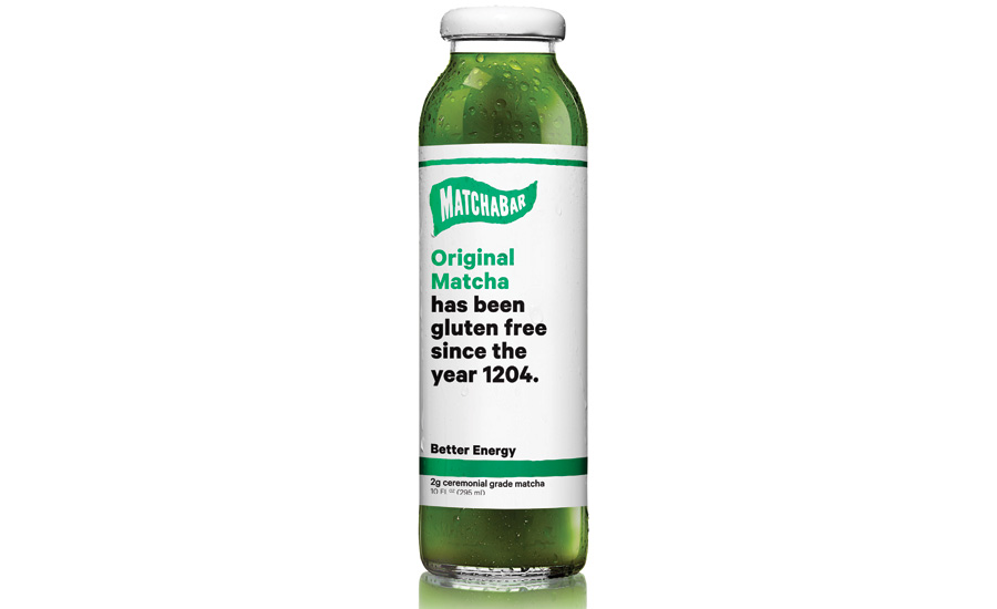
In conjunction with its expansion into retail and cafes, MatchaBar unveiled a new look for its line of ready-to-drink teas. The new design uses the packaging’s label as a platform to speak to its consumers, the company says. “The packaging refresh allowed us to create a way to let our beliefs, our interests and our associations with certain subcultures shine through,” Founders and brothers Graham and Max Fortgang said in a statement. Taller and sleeker, the new label balances negative space with pops of color and gives each flavor’s bottle its own personality using the label as a billboard for the brand’s voice, it says. Working with local comedians, social mavens and young copywriters, the brand collaborated to create a label that speaks to the cultural and social ties central to the community, it adds. Every season, MatchaBar will release a new series of labels, with the next collection set to launch this summer.
Bigger is better
Prestige Beverage Group LLC added limited-edition 1.5- and 3-liter bottles to its Champs de Provence Rosé portfolio. Priced at $35 and $120, respectively, the limited-edition bottles reflect the product’s successful launch in 2016, the company says. The Rosé features notes of red berries, citrus and orange blossom with a medium body, hints of raspberry and a mineral finish, it adds. The 1.5- and 3-liter bottles are available at select retailers nationwide while supplies last.
Three powerful changes
Last month, Yuengling & Son Inc. began rolling out packaging updates for its core brands: Yuengling Traditional Lager, Light Lager and Black & Tan. “We are excited to introduce updated packaging of our core brands, which features our powerful Yuengling Eagle & Barrel icon, a proud symbol of our family owned brewery since 1829,” said Dick Yuengling, owner and president, in a statement. This is the first time that Yuengling Traditional Lager packaging has been updated in nearly 30 years, the company says. Yuengling Light Lager relaunches with a new blue, white and cream look to highlight its refreshing characteristics, while Black & Tan’s new design highlights the brand’s well-balanced English half-and-half style, it adds. The new Iconic Eagle packaging is rolling out on all pack types.
Pacifi-can
Constellation Brands Inc. launched Pacficio in 12-ounce aluminum cans for the first time in the United States. Available in 12-packs, the new cans will be available in California, Nevada, Oregon, Washington, Montana, Hawaii, Texas, Arizona and Colorado. The launch of the 12-ounce can builds on the company’s February 2016 launch of Pacifico single-serve, 24-ounce cans, the company says. Additionally, the 12-ounce can format aligns with the Pacifico drinker’s active, adventurous lifestyle, it says. Throughout the year, the brand will support its 12-ounce can packages with 40 weeks of TV advertising in the Western United States, Texas and Colorado, it adds.
Baseball buds
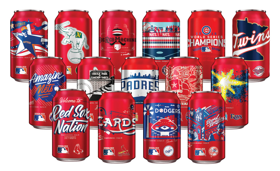
With the return of baseball season, Budweiser introduced customized, specialty MLB team cans featuring unique designs created by local artists who each represent Budweiser’s values and celebration of the pursuit of the American Dream, the company says. The limited-edition cans became available on Opening Day. “Baseball and the culture it created is a true celebration of the American spirit,” said Ricardo Marques, vice president of Budweiser, in a statement. “This year, we wanted to leverage our long-standing partnership with MLB to raise a toast to the fans by giving them a piece of their hometown to enjoy right in the palm of their hand with our MLB-designed team cans.”
Clean, healthy and pure
Troll Bridge Creek Inc. announced new branding for its Kiki Maple Sweet Water. The brand refresh gives the product a clean, healthy and pure image, the company says. “We are really pleased with the new look of our products as we think they reflect the desires of our customers — pure, clean and bright,” Chief Executive Officer of Troll Bridge Creek Keith Harris said in a statement. In addition to the branding update, the company also released two new sizes: a 240- and a 750-ml bottle. The bottles also feature a new screw cap, making the product more user-friendly and re-sealable, it says.
Looking for a reprint of this article?
From high-res PDFs to custom plaques, order your copy today!
