Dogfish Head packaging embraces off-centered innovation
Seven varieties part of initial redesign

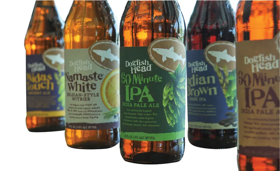
Dogfish Head Craft Brewery unveiled a new packaging design that brings focus to the creativity, high quality and often rare ingredients that go into its portfolio of beers, it says. The project was a collaboration between Dogfish’s in-house creative team and packaging design firm Interact Boulder. Seven Dogfish brands showcasing the new design will hit shelves this fall with additional brands to come later this year. The new designs also honor Dogfish’s foundational spirit of off-centered innovation and imagination by highlighting its legacy of exploring goodness through ingredients and processes, the company says. Ingredients are the stars of the design, showcased through illustrations that create realistic and authentic flavor expectations. For example, shoppers can see what goes into each bottle by viewing the side panel of each carrier, which highlights the specific ingredients and unique brewing process involved in creating each specific beer, it says. The new design also organizes key information, such as beer style and alcohol by volume, in a way that makes it easier for consumers to shop. The iconic Dogfish Head “shark and shield” logo and proprietary “Doggie” font are the two design elements that will carry through from the old packaging into the new style, it adds.
Looking for a reprint of this article?
From high-res PDFs to custom plaques, order your copy today!


