Davidson’s Organic launches rebrand design
Honoring 40th anniversary rebrand includes packaging redesign
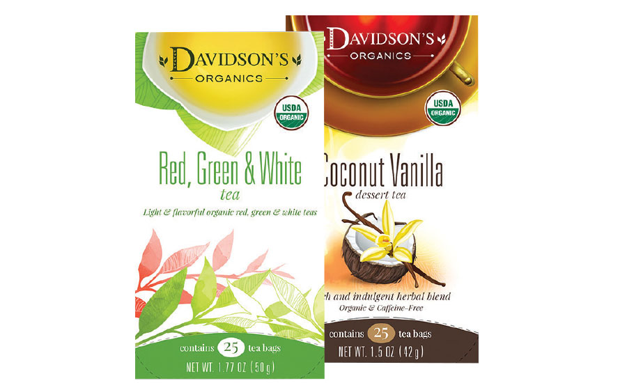
Celebrating its 40th anniversary, Davidson’s Organic Teas launched a company rebrand featuring redesigned packaging. The new packaging’s rich color effectively highlights the tea’s quality, health benefits and convenience, while the bright color highlights the refinement, grace and maturity Davidson’s has gained from experience and captures the essence of the tea inside, the company says. Additionally, each product category within the major line has its own graphic, each slightly different but unified with all of the others, it adds. “A lot has changed since Davidson’s first started blending spices 40 years ago,” said Kunall D. Patel, co-owner of Davidson’s Organics, in a statement. “And with consumers living a busy lifestyle today, they want simplicity, value, health benefits and convenience all packed into a simple format to make a purchasing decision. Our new packaging design meets all these needs, and provides a visually friendly and clean label for information product benefits, company background, certifications and ingredients.”
Looking for a reprint of this article?
From high-res PDFs to custom plaques, order your copy today!


