Beverage packaging benefits from unique containers, designs
Product positioning vital for packaging design

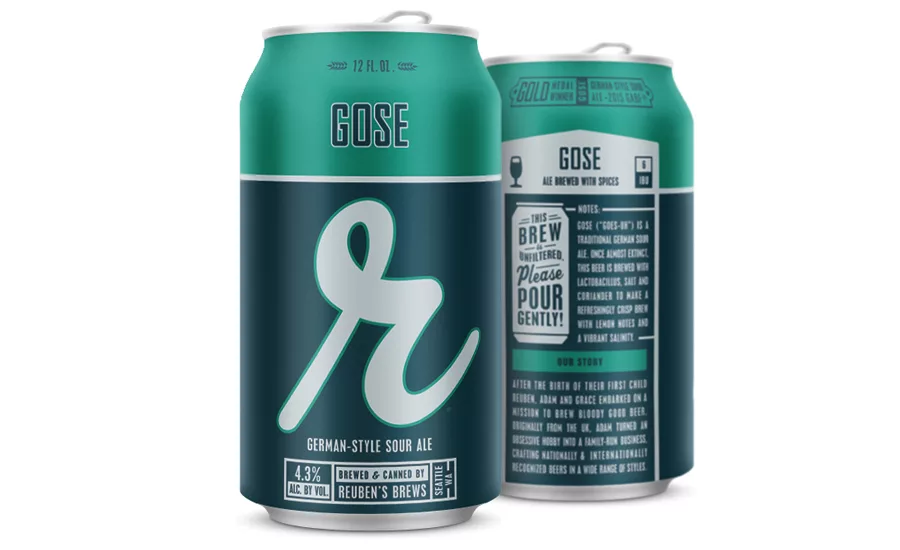
Master brands plus extensions must be considered for packaging design, Blindtiger’s Oceania Eagan says. The design firm applied this when working with Reuben’s Brews’ core lineup of craft beers. (Image courtesy of Reuben’s Brews)

The old saying goes that a picture is worth 1,000 words. For beverage-makers, the design of their packages far exceeds that word count as it serves as the first in-person connection to consumers — both new and old.
“Packaging design is the voice for a company,” says Oceania Eagan, creative director and founder of Seattle-based Blindtiger Design. “A critical place to start when approaching the design of packaged products is to first address the system of the full family of products. Consideration must be made to how the full lineup of flavor varieties will look together but also allowing each to stand strongly on their own. Many retailers are moving to shelving product by flavor or type rather than by brand.”
Eagan adds that among the first steps that brand owners should take is developing a system that identifies the current and possible future of a product, such as whether there will be sub-brands and/or flavor varieties, how those extensions will communicate with consumers (on their own or in-line with the flagship brand), and whether the primary communication focus on the flagship brand will trickle down to the flavor options.
“In either case, having a consistent thread across the full system is essential,” she notes.
Jeff Grindrod, president and founder of New York-based BevBiz Marketing, also stresses the importance of having a clear direction when developing packaging. “[P]robably the most important thing is [to] get your product positioning … what you’re trying to do with your package, down in writing first where everybody agrees to the direction that you’re going and why,” he explains.
Grindrod notes that doing rigorous preparation prior to designing will help streamline the process as a whole, which also should help keep costs in check.
Real world application
Just as the saying goes that the proof of the pudding is in the eating, package design principles garner support from successful examples.
Blindtiger’s Eagan highlights Reuben’s Brews’ core lineup of craft beers as an example that addresses a master brand and lineup extensions.
“The consistency across the design layout for each beer allows consumers to instantly recognize the brand,” she says. “Style varieties are secondary, but quality is reinforced by the consistency of the master brand. Reuben’s also provides a great example of the ability to intentionally depart from the overall system design to call attention to specialty or seasonal releases. This departure maintains key components of the core design, which consumers have become so connected with, yet allows for additional storytelling with the elevated art and design for these special releases.”
BevBiz’s Grindrod also notes the design impact that seasonal products are having not only on craft beers but better-for-you beverages as well. “The designed bottles are being very reflective of the season they’re sold in,” he says.
But no matter what the season, brand owners also are tasked with ensuring packages can stand out within the crowded beverage space. Among the ways they are doing this is through unique label designs as well as containers.
“We’re starting to see a lot of custom packages, especially bottles that are unique shapes and sizes,” BevBiz’s Grindrod says.
For example, the company has worked with High Stick Vodka, a premium Canadian vodka that is packaged in a hand-blown glass bottle shaped like a hockey stick. The package is designed to appeal to avid hockey fans, Grindrod notes.
Blindtiger’s Eagan also has noticed an increasing desire by brand owners to have a package that is distinctive to them. “We also get a lot of requests for specialty packaging: unique, physical form packages that are a departure from the standards that are common to their industry,” she says.
Among the ways Blindtiger applies this is through its illustration capabilities. “Our strength in traditional illustration, and hand lettering is one way in which we elevate specialty designs,” Eagan says. “This adds a whole level of uniqueness: hand-crafted art to reflect the hand-crafted product itself.”
Color choices are other ways that brand owners are employing, design experts note.“I’m seeing a lot of clear spirits and clear products that are using darker colors in their packaging to differentiate themselves,” BevBiz’s Grindrod says.
Blindtiger’s Eagan notes that label stock innovations are catching wind as well. “With so many products using stock or standard package types (for example, the same brown bottle everyone else uses), the use of specialty papers is a great way to have added uniqueness and attention given to the product,” she says. “We are starting to see an increase of the use of metallic and embossing as an answer that provides a great tactile feel and look.
“Additionally, with technology growing to support new print capabilities, we are starting to see more options for artwork application and printing,” Eagan continues. “Digital reproductions of paintings and photos, for instance, was cost prohibitive not long ago on many package types, but has become far more accessible. Professional and quality hand-labeled packages are also becoming more commonplace because of more access to quality printing.”
Setting the stage
Although a clear focus is crucial before beginning any package design process, different considerations also need to be taken for new products and brands versus redesigns.
“New products or brands allow for a fresh look at how to best approach the design,” Eagan says. “The current market and competition is a great place to start in evaluating what the immediate needs are; however, I have found that designs only giving answer to the current landscape fall short over time. For products or brands that are new to the market, building a foundation that can not only have strength in the short term, but also hold strong as the market evolves is critical.”
When it comes to redesigns, the process can include more layers, design experts note.
“I think the big difference is with a redesign you’ve got to be really aware that there are a group of consumers who are already buying the product,” BevBiz’s Grindrod says. “You need to be more of an evolution than a revolution because if you go too far away, you potentially could turn off your current consumer base because they don’t feel it’s the same product as it was before.”
Blindtiger’s Eagan also notes that the brand’s equity needs to be considered during a redesign; however, that does not mean the rebranding process needs to be subtle.
“Careful consideration to the goal of the rebrand must be made to guide us in the best approach and direction for the updated or new look,” she says. “For some, this means making changes to the packaging lineup and maintaining the master brand foundation previously established. For others, a look at the brand itself is required, which allows us to build a new and stronger foundation from which to build off of.
“In addition to the design itself, we also have to consider the existing product and packaging types because, frequently, a rebrand requires change not only in the appearance of the packaging, but also in the vessels themselves,” she continues.
Setting the curve
With shelf space at a premium, Eagan says brand owners need to take this into account as they move forward.
“Retailers only have so much room to accommodate for the huge numbers of craft and small-batch beverages,” she says. “In many of the saturated markets, shifts are already starting to happen. For example, they are shifting the short side of a box as the ‘front’ rather than the long side. As consumers demand more variety and choice, retailers will continue to give answer to this, but at the end of the day, there is just only so much shelf space available.”
As beverage-makers strive to help their products stand out through unique, eye-catching packaging, the key element will be anticipating the next trends in beverage packaging.
Already garnering attention, environmentally friendly packaging could continue to grow from the base it’s at, BevBiz’s Grindrod says.
“Obviously, people are extremely concerned with what’s going on with the environment, [and] how do I do something that makes sure things are more recycable?” he asks.
And although a significant driver in packaging evolutions comes from consumer trends, it is not the only area that could impact the beverage market. “[T]here’s also the functional side of trade driven,” Grindrod says. “An [example] is Heineken’s BrewLock. It’s a completely different form of draft system that ties into the environmentally friendly side, it is 100 percent recyclable and you don’t have to send it back to the breweries to be recycled. … Also, from a functional standpoint, the packaging helps to save on electricity, [and] it also helps to save on operational costs. It’s lighter so it’s easier to use.”
Looking for a reprint of this article?
From high-res PDFs to custom plaques, order your copy today!


