Bud Light, Hacker-Pschorr release redesigned packaging
Diet Coke, Korbel release limited-edition packaging designs

A new identity
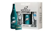
Bud Light announced the first major overhaul of its visual identity in eight years as part of a larger brand evolution underway. The redesign includes a reimagined Bud Light logo and contemporized primary and secondary packaging. By bringing back the brewer’s trademark “AB” crest — not used on Bud Light packaging since 2001 — the design emphasizes the brand’s premium ingredients; care in brewing; crisp, clean finish; and smooth drinkability, the company says. “In 2016, we’ll put a more modern twist on Bud Light, from the way the brand looks to the way it acts,” said Bud Light Vice President of Marketing Alexander Lambrecht, in a statement. “We’re proud to introduce our fresh new look, which pays homage to our most iconic packaging of the past, yet feels current and unique with its bolder logo and distinctive blue colorway. It’s a design that truly stands out from what’s become a sea of sameness in the light beer category.” The new Bud Light packaging rolls out nationwide in cans and glass and aluminum bottles in early spring.
Capturing a spirit
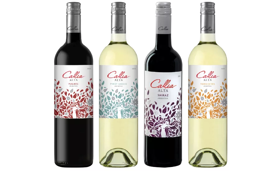
In a nationwide effort, U.S. importer Palm Bay International and Argentinian winery Bodegas Callia launched new packaging for their Callia Alta range. Nestled in the Tulum Valley in Argentina’s San Juan province, the winery’s name is inspired by the legend of a young immigrant woman named Callia who arrived in the area and described it as a paradise endowed with abundant fruits despite the desert landscape, the company says. The new label captures Callia’s whimsical spirit with a design that features a woman surrounded by nature, hot-stamped leaves and embossing on a velum paper stock. The Callia Alta range includes Malbec, Shiraz, Pinot Grigio and Torrontes varieties, each crafted to showcase the ripe fruit flavors achieved in the dry, sunny climate of the Tulum Valley and retailing for $8.99.
Making history
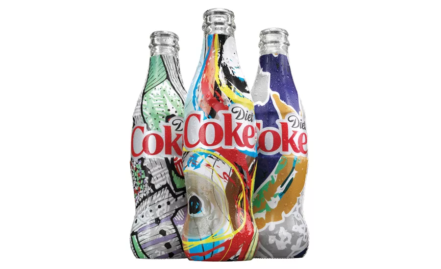
For the first time, Diet Coke released millions of unique package designs with the launch of the Diet Coke It’s Mine program. The innovative initiative, a continuation of the brand’s Get A Taste campaign, launched Feb. 1. The program also marks another first for the brand — the introduction of the Diet Coke 12-ounce glass contour bottle. The bottles feature one-of-a-kind, vibrant designs, which means no two bottles are the same, the company says. Diet Coke partnered with HP Inc. to leverage its innovative HP Indigo digital printing technology. Inspired by the bubbles, fizz, taste and spirit of Diet Coke, 36 base designs were created. Then, using HP’s software, the base designs were used to create millions of new graphics. In addition to the Diet Coke 12-ounce glass bottles, a select number of patterns also will be available on 7.5-ounce mini-cans, 8.5-ounce aluminum bottles, 12-ounce and 16-ounce cans, and 500-ml and 20-ounce PET bottles.
Take an adventure
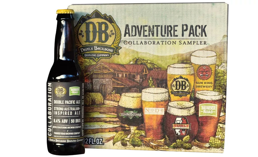
Devils Backbone Brewing Co. debuted its annual Adventure Pack Collaboration Sampler. For the 2016 pack, Devils Backbone reached out to five other brewers to help craft a collaboration pack. The 12-pack is available throughout Virginia; Washington, D.C.; Maryland; North Carolina; and West Virginia. Six beers are featured in this year’s collaboration sampler: Devils Backbone’s Vienna Lager, a 5.2 percent alcohol-by-volume (ABV) amber lager; NoDa Brewing Co.’s Session IPL, a 3.8 percent ABV session India-style pale lager; Sun King Brewing Co.’s Another State of Kind, a 6.8 percent ABV double-dank cream-style ale; Surly Brewing Co.’s Risen, a coffee and oak, double brown ale brewed to 8.4 percent ABV; Thunder Road Brewing Co.’s Double Pacific Ale, an 8.4 percent ABV Australian-style ale; and Wicked Weed Brewing Co.’s Seven Summits, a 10.5 percent ABV Imperial Stout.
Making the old new again
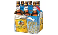
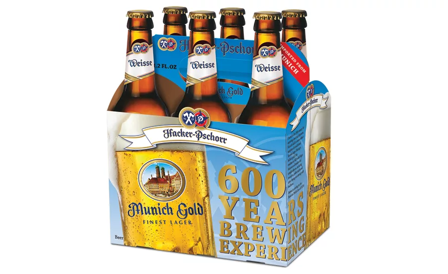
Founded in the 15th century, Hacker-Pschorr recently received a 21st century face-lift with a modern packaging redesign in the United States, the company says. The redesign was aimed to enhance the packaging’s quality and appearance and affected the brand’s entire line of packaging, including bottle labels and cases. The brand also strived to remain true to its fundamental values and maintain the trust of its existing consumer base, it adds. “Hacker-Pschorr is 600 years old, but that doesn’t mean we have to look it,” said Charles Stanley, Hacker-Pschorr’s U.S. brand manager, in a statement. “We’re taking a risk because we have a solid consumer base, and we need them to know Hacker-Pschorr is still their beer. But the future of the brand depends on today’s younger consumers, and the current packaging looks like it was designed before a lot of them were born.” The new Hacker-Pschorr packaging began rolling out on retail shelves last month.
Looking for a reprint of this article?
From high-res PDFs to custom plaques, order your copy today!
