Deschutes Brewery updates carton and tap handle designs
New look displays company name prominently

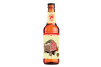
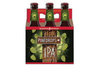
Deschutes Brewery’s bottles, cartons and tap handles now sport a new, updated look designed to better reflect the quality of the beer inside while increasing shelf presence and display impact, the company says. The new look displays “Deschutes Brewery” prominently to help pull together the company’s brands, it adds. The design change was spurred, in part, to help improve brand awareness and better stand out in an increasingly crowded category, the company explains. Each of the brewery’s brands has its own color palette and custom typeface, with company branding in black for the mainline and seasonal brands, and red for the Bond Street Series. The classic illustrations associated with each brand have been retained in the new design to further highlight each beer’s individuality. “As the craft beer segment continues to grow, and we continue to expand, it’s critical that we stand out on the shelf and reinforce our brand,” said Jeff Billingsley, director of marketing for Deschutes, in a statement. “We’ve incorporated many key elements in the new design that should help us achieve this goal. We are excited to hear what our fans think about the new look.”
Looking for a reprint of this article?
From high-res PDFs to custom plaques, order your copy today!
