Bowtie design
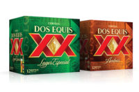
Budweiser revealed a new design for its can and secondary packaging. The new can design is Budweiser’s 12th since Anheuser-Busch began offering its flagship brand in cans in 1936. The focal point of the design is Budweiser’s iconic bowtie, complemented by the time-honored Budweiser creed and Anheuser-Busch medallion. Budweiser’s new “bowtie” can and secondary packaging designs will be the global standard as the brand continues to expand internationally, the company says. Using the same design principles as the newly designed can, the redesigned secondary packaging will be used for all package configurations and emphasizes the Budweiser creed, which highlights the beer’s unique beechwood aging process and 135-year-long commitment to quality, it says. The packaging also will feature a quick response (QR) code to enable Budweiser to regularly communicate with consumers.
Visual impact
Last month, redesigned Honest Tea and Honest Ade PET bottles began hitting store shelves. Honest Tea, the Bethesda, Md.-based wholly owned subsidiary of Coca-Cola, initiated the packaging design changes more than three years ago. The new designs feature a white background that highlights images of the ingredients. To further increase shelf standout, the brand’s logo has increased in size. Tea leaves and large cut-open fruit images are presented in an elegant and often playful way to reinforce the simplicity and deliciousness of the ingredients, the company says. The tea labels also feature a prominent call-out specifying “Brewed Organic Green, Black or White Tea Leaves” to reinforce the authenticity of the ingredients. The images on the Honest Ade labels include fun treatment of the fruit by giving it unexpected scale and context, the company says.
Extraordinary design
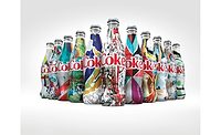
The Coca-Cola Co.’s Diet Coke brand launched a limited-edition can design. The latest evolution of Diet Coke’s “Stay Extraordinary” campaign features a modern aluminum can design for fall. The new can design spotlights a section of the Diet Coke logo, which is cropped to show the “D” in Diet and “k” in Coke. The design is set against the brand’s signature silver backdrop. San Francisco-based Turner Duckworth design agency created the design. The new can and packaging design for Diet Coke will be available through November, which is when the brand’s holiday-themed cans will launch.
Blockbuster deal
Hangover Joe’s teamed up with Warner Bros. to roll out Hangover Recovery Shots featuring images of characters from the hit movie “The Hangover” printed on the bottles. The Hangover Recovery Shots are sold featuring an image of one of the film’s cast and a quotation from the movie on each bottle. The limited-edition shots will showcase Alan, Phil, Stu, Doug, Mr. Chow and even the tiger for movie memorabilia collectors and general consumers.
Conservation emblem
Hawaii-based premium natural water company Hawaiian Springs LLC announced its bottles will bear the emblem for Preserving Paradise, the conservation initiative the company launched this spring. Under the Preserving Paradise initiative, Hawaiian Springs Young Natural Artesian Water will dedicate a portion of its sales to support Hawaii’s environmental organizations that protect the islands’ fragile and unique ecosystem, particularly endangered native flora and fauna. The company says the new labels call attention to Hawaii’s biodiversity, and it hopes consumers will join them in safeguarding the islands’ natural splendor.


